The Good. The Bad. The Ugly.
How three tech companies got it right, and wrong, with their new logos.
It has been quite a month or so in logo-land with a redesign popping up seemingly every other day. So much is tied up with a company’s logo—a small graphic expression intended to personify a brand’s values and vision into something that is memorable and iconic. Some of the biggest players in the tech business have rolled out new logos, with mixed results.
The Good
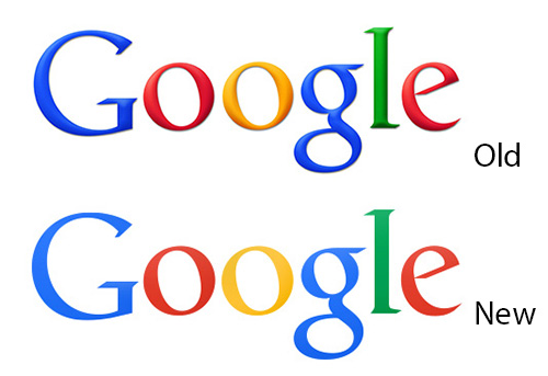
Google has clearly been on a mission to bring a better user experience to everything they do. The changes are incremental, continual and are really beginning to shine. A flatter Google logo surfaced last week and the internet buzzed with the news that Google too had updated their look and ditched the bevels. The turn to flat in UI is a sign that technology is maturing and finding its own language rather than skeuomorphics. The new flat Google logo ties all of the UI changes Google has made recently.
The Bad
Yahoo is one of the internet’s iconic destinations and their logo was both familiar and exuberant. The new logo is bad for a variety of reasons, but perhaps most damningly, it does not pass the “I wish I had done that” test. Creatives know what I’m talking about, it’s that gut reaction we get when we come across something so beautiful, so brilliant, so well crafted, our hearts ache that we didn’t create it. The new logo looks a little anorexic, and really doesn’t scale well to the size its most used for—a web page. Yahoo is also bucking the move to flat design and has added bevels to their new logo.

The Ugly
Bravo to Microsoft for a coherent brand strategy that seeks to link all of their products identities with a clean, modern design. The “B” icon is a bit brutal though, and why is it so abstract? Especially for a site that seeks broad consumer reach, couldn’t they have given us just a little something clever in there? It looks like a brand hammer.
One Comment