GIANT LOGO!
I have always wanted to start an agency called “GIANT LOGO!”. It would be a client’s dream come true. We would do only one thing, but do it well. Yes, just the logo, nice and big. How big, well, billboard size. So, you can imagine my consternation to see Yahoo!’s latest ad campaign.
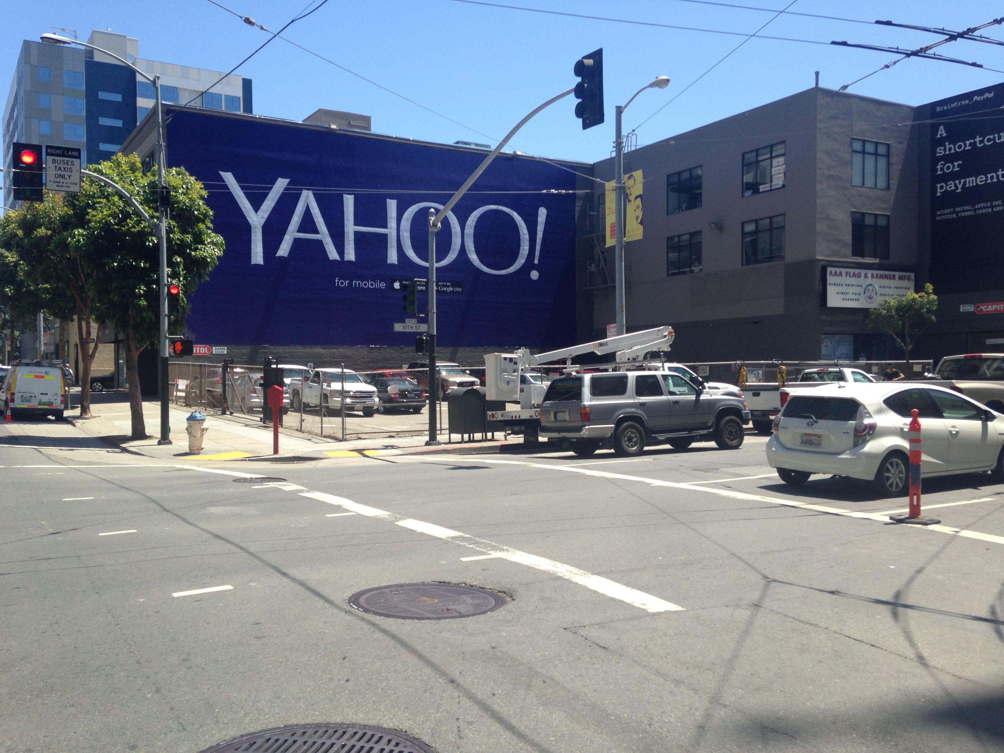 These GIANT LOGO! billboards have been appearing all over San Francisco. I was trying to photograph one location on Lombard Street, but the sun was behind the billboard and I just couldn’t get a decent exposure. I did notice a funny thing, which was a tourist taking the same picture, although I assumed he was taking a picture of the Mel’s Drive-In below the billboard.
I came across several locations on Mission street, just blocks from Twitter HQ. While I was looking for the best angle, I noticed another person photographing the same thing. I had to find out, why was someone else felt so compelled to stop and take a picture of Yahoo!’s most excellent GIANT LOGO! He was Patrice, visiting from France. I asked why he was taking a picture of the billboard. He wanted to show his friends back in France the strange things Americans do. He also thought the billboard was bit desperate and that maybe Yahoo! is in trouble.
One of design’s most basic tenants is the role of hierarchy, the most important thing is generally, largest, followed by supporting elements. IF you look closely under the GIANT LOGO! you will see the word “for mobile”. It is so small that the contrast in sizes is enough to set off vertigo. Why is “for mobile” so small? Is it a secret message? A footnote? Is it some kind of cryptic call-to-action?
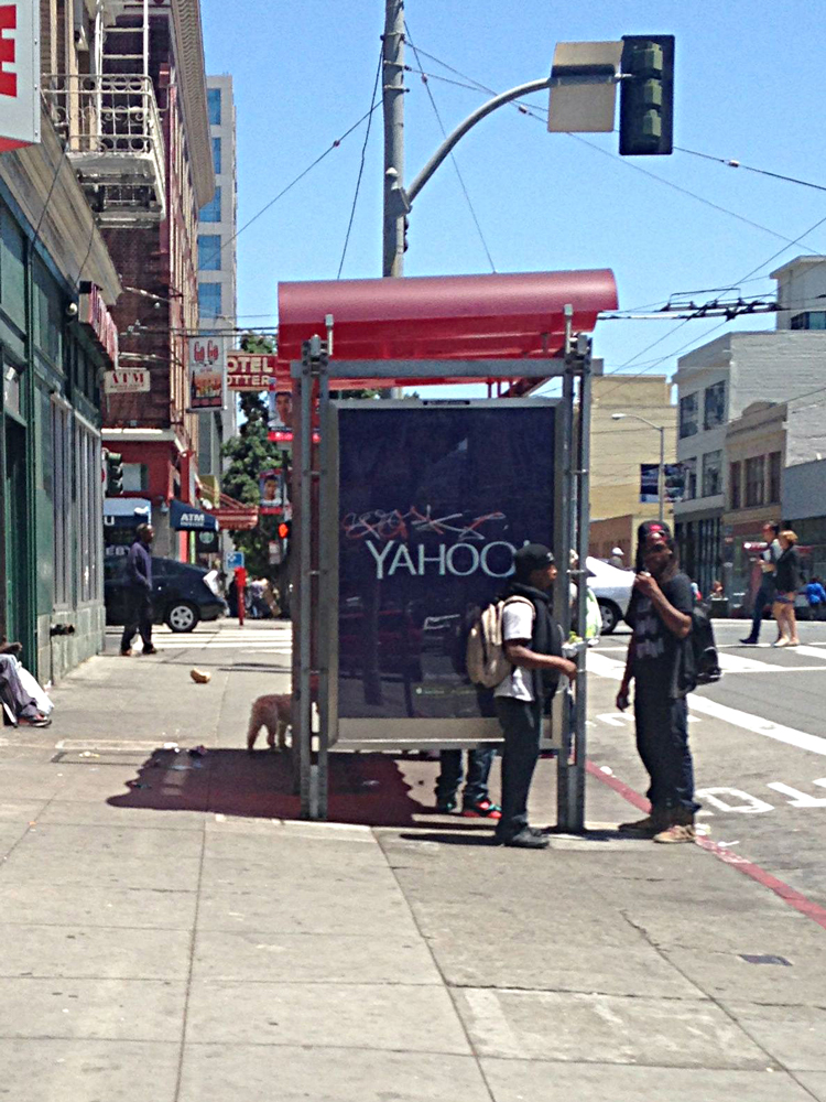
The billboards got my attention, so something is working. I decided to visit the mobile Yahoo! Maybe something cool awaited me for finding the hidden message. I found only the usual sponsored content that passes for news on Yahoo! these days.
Whatever this campaign is about, it’s half-baked, but I still love the idea of building a bigger logo.