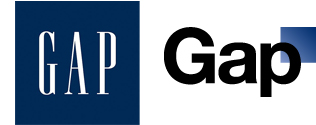
The new Gap logo is a hoax
At least I hope it is. This is a brave new world of marketing, call it mendacious marketing. A company as rich and sophisticated as The Gap is not going to quietly hoist something as important as a logo on the world overnight and hope no one notices it was set in Helvetica. The reaction was overwhelmingly negative with The Gap quickly releasing this statement on Facebook:
 “Thanks for everyone’s input on the new logo! We’ve had the same logo for 20+ years, and this is just one of the things we’re changing. We know this logo created a lot of buzz and we’re thrilled to see passionate debates unfolding! So much so we’re asking you to share your designs. We love our version, but we’d like to… see other ideas. Stay tuned for details in the next few days on this crowd sourcing project.”
Crowd sourcing, ugh. But seriously, how come they’ve got this crowd sourcing plan ready so soon? The whole thing is kind of mind-numbing, The Gap, the crown jewel of Baby Boomer corporate casual is suddenly going to throw it’s corporate identity to the “crowd”? This will be fun to watch unfold.
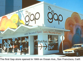
My vote is a return to the the logo before the blue box thing. Although I just noticed it looks like a hipper version of bloomingdales.


